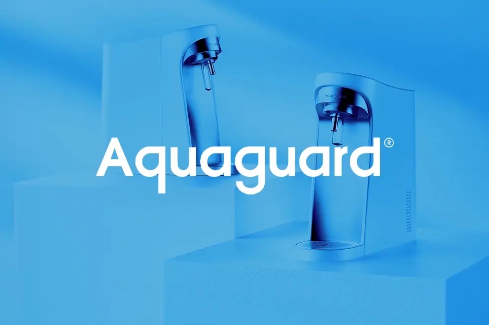
Brand Identity
Kasih. Rebranded Kasih around the cultural insight of Middle Eastern togetherness

Overview
Kasih, a trusted name in Middle Eastern kitchens for generations, came to us for a rebrand. The goal was simple: stay true to the community it’s grown with, while making the brand feel fresh and relevant for today. We found our way in through one clear insight: Arabs do things together. They eat together, celebrate together, and trust what comes from within the community. No other brand in the category was talking about this. But for Kasih, it had always been part of the story. 'Better Together' was born from this cultural insight.
But there was another challenge. On the shelf, all products looked the same. We needed Kasih to stand out. So, we went big and bold, with a confident, bright red that felt proud and full of life. We also turned to something deeply cultural—modern Arabic calligraphy. It’s become more popular in recent years, and for good reason. It brings an organic, nostalgic feel that today’s Arab consumers connect with. It blends tradition and innovation in one visual stroke, and for Kasih, it was the perfect way to speak to both older and newer audiences at once.
The new Kasih logo was designed to reflect the true Levantine spirit—not just another mezze brand. It carries the warmth of a matriarch’s love, not just a familiar pantry label. It treats food as an experience, not just a quick bite. It brings heart to every dish, and gives the brand a new, dynamic voice—rooted in tradition, but ready for what’s next. We didn’t change what Kasih stood for. We simply helped it say it louder. And with heart.